Neutral colors often play the unsung heroes in the realm of painting. While vibrant hues like red, blue, and yellow get ample attention, the subtle strength of neutral colors such as gray, brown, and taupe should not be underestimated. These hues are pivotal in creating depth, mood, and realism in a composition. Understanding and mastering the art of neutral color mixing can significantly enhance one’s painting techniques, providing balance and cohesion to artworks both in traditional canvases and contemporary digital art pieces.
In this blog, we delve into the nuances of mixing neutral colors, exploring their significance in balancing compositions and offering tips on producing a variety of captivating shades. Geared towards both budding artists and seasoned professionals, this in-depth exploration aims to reveal the transformative power of neutral hues in visual art.
The Role of Neutral Colors in Art
Enhancing Visual Balance
Neutral colors serve as the backbone for balancing vivid colors within an artwork. Their subtlety allows the more vibrant hues to shine without overwhelming the viewer. For traditional art collectors, the strategic application of neutral tones can connect themes and elements cohesively, presenting a well-composed and aesthetically pleasing piece. Likewise, in digital art, skilled use of neutral tones can bring dynamism and dimension, ensuring that each color and form interacts harmoniously.
Establishing Emotional Tone
Beyond mere aesthetic composition, neutral hues effectively establish the emotional tone of a piece. A painting dominated by dark grays or browns might evoke a sense of melancholy or introspection, while lighter neutrals can bring about feelings of serenity and balance. The versatility of these shades allows artists to express a wide range of emotions, subtly guiding the viewer’s perception and response to the artwork.
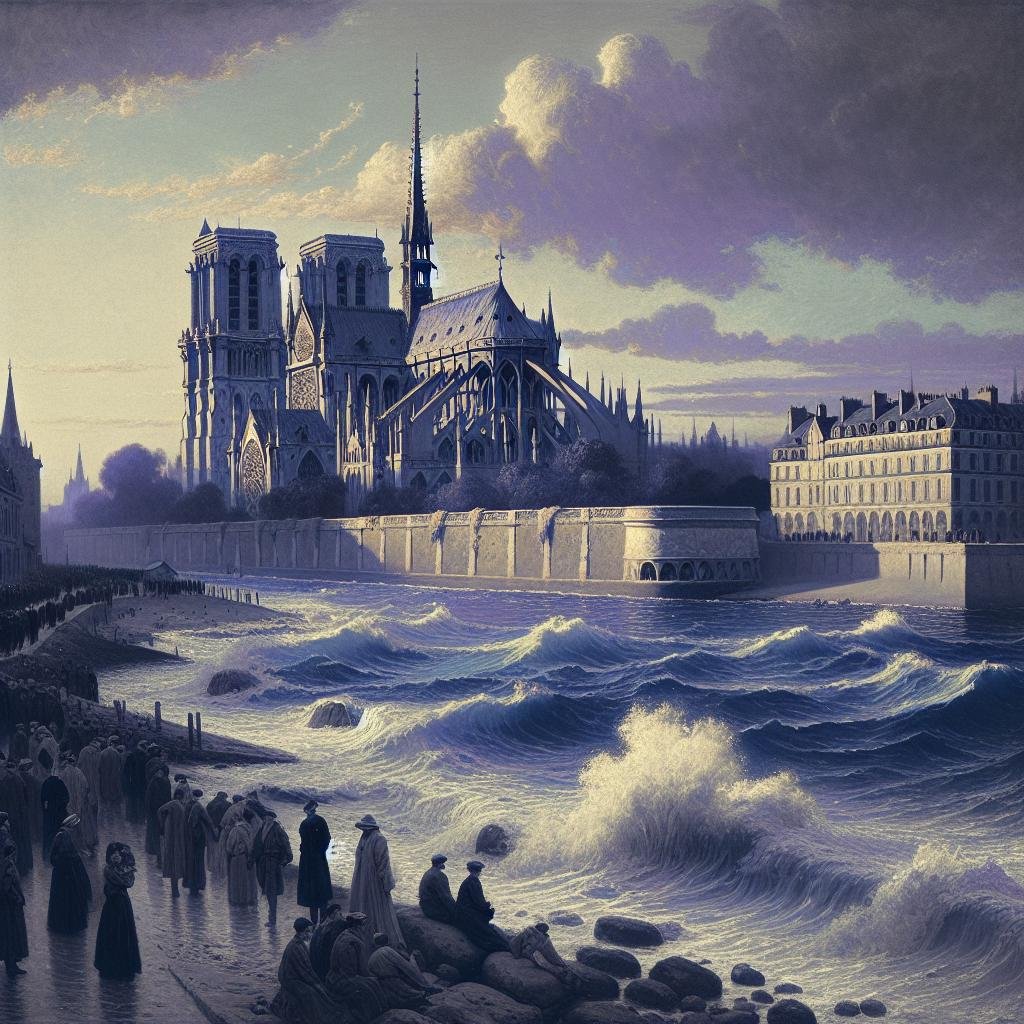
Mixing Neutral Colors: A Guide
Understanding the Color Wheel
A solid grasp of the color wheel is foundational to successful color mixing. Recognizing that mixing complementary colors—those opposite each other on the wheel—produces a neutral tone is key. For example, mixing red with green or blue with orange results in various grays and browns. Artists can manipulate ratios and intensities to create the perfect neutral shade, rich with undertones that influence its perception and use in a piece.
Creating a Palette of Grays
Gray is a versatile neutral color that can lend sophistication and depth to an artwork. Mixing black and white is a basic method, but adding a touch of complementary colors such as red and green or blue and orange can yield grays with subtle hints of color, enriching their application in depicting shadow, depth, and atmospheric elements. Consider how a hint of blue-gray can enhance a stormy sky or a warmer gray sets an introspective mood within a portrait.
Formulating Rich Browns
Browns are a staple of neutral tones in painting, offering a wide array of uses from skin tones to earth and natural elements. Mixing complementary colors like red and yellow with blue creates a base brown. However, fine-tuning this brown by adjusting the proportions and adding touches of other colors can help an artist achieve infinite varieties. Adding a bit of white results in a tan shade, while incorporating black can deepen the brown, ideal for richer compositions.
Advanced Techniques for Neutral Color Mixing
The Impact of Texture
Texture is oftentimes an overlooked element when dealing with neutral colors. The physical or virtual texture on a canvas can affect how neutral colors are perceived. In traditional painting, different brushstrokes can add dimension to shades of gray and brown, creating the illusion of light and depth. In digital art, manipulating layers and effects can mimic these textures, showcasing the intricate way neutrals interact with their surroundings.
Using Mediums to Modify Neutrals
The addition of mediums, both in physical paints and digital painting technologies, can dramatically alter the character of neutral colors. Oil or linseed mediums can make neutrals more translucent in traditional artwork, enhancing layering effects. In digital art, adjusting transparency levels or blending modes can replicate similar effects, allowing transparent neutral layers to build complexity within a piece.
Neutral Colors in Modern Art Trends
Neutral Palettes and Minimalism
The recent surge in minimalist art has seen a resurgence in the use of neutral colors. Artists favor neutrals to create serene, clutter-free aesthetics that emphasize form over color. The effect is calming yet striking, where shapes and concepts speak louder than vibrant hues. This trend resonates in both the traditional art markets and the digital realm, where minimalistic graphics find vast appeal in contemporary design.
The Versatile Use of Neutrals in Digital Art
Digital artists have embraced the power of neutral tones as technologies advance. These colors, while subtle, offer depth and maturity to digital artworks through their use in shading, texturization, and balancing compositions. Neutrals can act as a canvas or background that allows digital elements to interact more dynamically, enhancing the realism and emotional impact of the digital piece.
Neutral colors in painting may not always stand at the forefront, but their powers are undeniably profound. Mastering the art of neutral color mixing can dramatically elevate the quality and impact of artworks, providing a sophistication and depth that pure colors alone cannot achieve. By embracing the equilibrium and subtlety they offer, both traditional and digital artists can invigorate their compositions, allowing every hue to contribute harmoniously to a refined and cohesive visual experience.
Whether you’re exploring the muted elegance of minimalism or enhancing the depth of photorealism, the balanced application of neutral colors remains a timeless and essential skill. As more artists explore this rich palette, the world of art continues to evolve, enriched by the understated yet powerful presence of neutral hues.


